Samsung’s weird Watch Ultra design could be a positive compromise
-
by Anoop Singh
- 11
Samsung’s next product launch is just around the corner, and we’re expecting a new range-topping smartwatch to join the fray. Renders of the Galaxy Watch “Ultra” broke cover recently, offering a glimpse of a smartwatch that looks nothing like what Samsung’s offered before. It boasts a divergent design with a more imposing “Ultra” aesthetic. While I’m a big fan of the leaked design, not everyone is sold on it.
Sure, it’s a surprising development, considering the mounting hype for the return of a square Samsung watch to rival the Apple Watch Ultra directly. However, I argue that the squared-circle combo, albeit questionable to some, offers more potential than square or circular designs alone.
Ultra volume, ultra everywhere else?
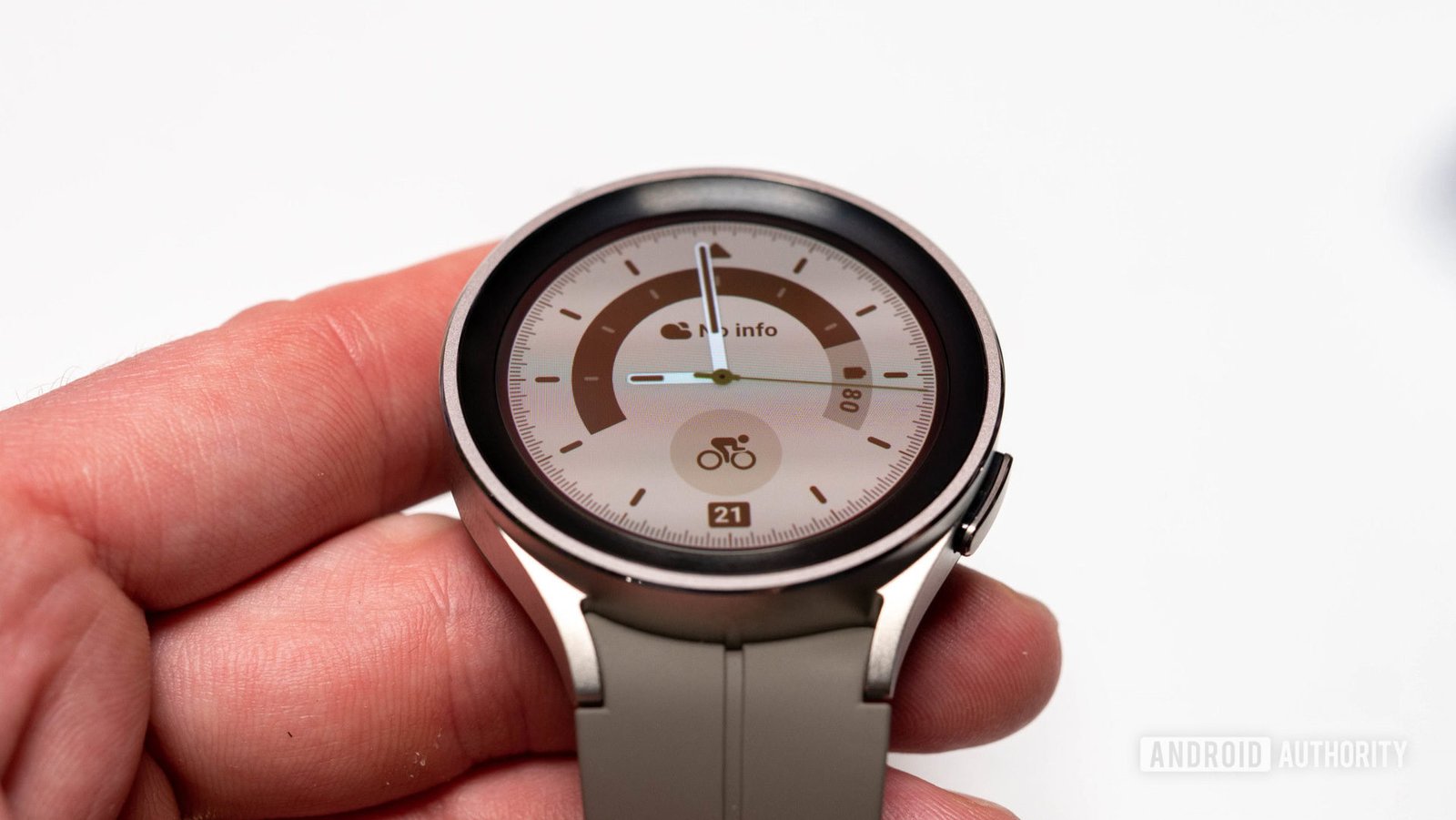
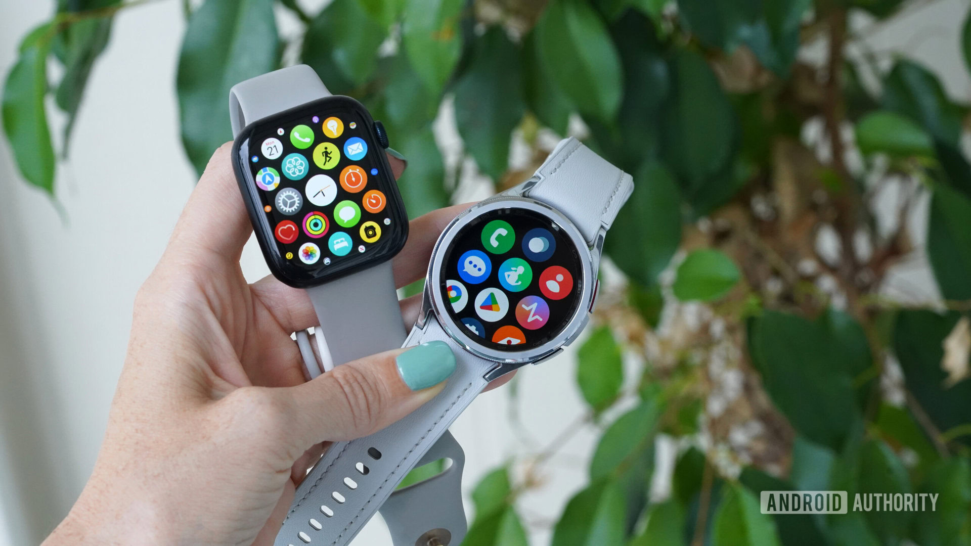
Although Samsung has experience with square watches, keeping the core experience of its flagship wearables similar is in the company’s best interest. This means keeping the circular lens with the prized rotating bezel and a consistent Wear OS interface across the Galaxy Watch family. It allows new users and older Galaxy Watch graduates to feel immediately at home.
However, there are limits to homogeneity across device generations. Even as smartwatch design matures and packaging improves, finding space within the limited confines of a smartwatch’s body becomes more challenging. This is true for Samsung’s current circular disc design, as the Galaxy Watch 6 series doesn’t offer significant benefits over the Galaxy Watch 4 released two years before. This refined design is now offering diminishing returns.
The Ultra’s solution is its biggest point of contention: a stepped, squared-off frame that adds significant bulk below its circular dial. Yes, it looks chunky and brutish, but it theoretically allows Samsung more room within and around the smartwatch without completely ditching its trusted formula.
While chunky and brutish, this design theoretically allows Samsung more room to innovate without ditching its trusted formula.
That room, importantly, can be used for improvements or new features, allowing Samsung more flexibility with its packaging options.
Based on current rumors, it’s unclear if Samsung will truly maximize this design. However, immediately apparent is the third “Quick Button” between the traditional two-key arrangement, which could offer programmable functionality similar to the Apple Watch Ultra’s Action Button. On the opposite edge, there are deep dual speaker slits, hinting at improved audio for on-device alerts and calls. A watch strap that sits flush with the squared body adds to the imposing aesthetic. Internally, there is more space for additional or upgraded hardware or smarter cooling for more performant chipsets.
If the Ultra suffix is here to stay, you’d expect it to offer buyers even more down the line. This body shape provides a new platform on which to develop.
Do you like the design of the leaked Samsung Galaxy Watch 7 Ultra?
1337 votes
Are the compromises worth it?

Kaitlyn Cimino / Android Authority
Every design has compromises, and the Ultra’s design is a trade-off between features and comfort. Granted, there is a lot we don’t know yet.
The watch could be surprisingly comfortable depending on the body’s depth and the revised watch strap mechanism. With a 47mm dial and stockier design, the Galaxy Watch Ultra could weigh more than the already hefty Galaxy Watch 6 Classic. However, the use of titanium in its construction could negate this somewhat.
I admit that larger watches are also more likely to be smashed against environmental objects, rock, and move around on a user’s wrist during activity or general use, marginalizing those with smaller, more petite wrists. However, this can be a problem for a watch of any shape. It’s not an inherent mark against this particular design.
Call me crazy, but I think this concept is anything but ugly. I’d argue it’s rather exciting.
So why offer a smartwatch with such a contrived design, especially considering the drawbacks? If you look beyond the questionable aesthetics, this design meshes the best of square and circular watches. I’m pro-innovation, provided that the innovation introduces adds value. Samsung’s past three smartwatch generations have offered iterative updates, with few new additions, design deviations, and negligible gains. The new body design offers more potential for new features and innovation without sacrificing the Galaxy Watch line’s core identity.
Call me crazy, but I think this concept is anything but ugly. I’d argue it’s rather exciting. Whether Samsung fully exploits it with the first edition Galaxy Watch Ultra is another story.
Samsung’s next product launch is just around the corner, and we’re expecting a new range-topping smartwatch to join the fray. Renders of the Galaxy Watch “Ultra” broke cover recently, offering a glimpse of a smartwatch that looks nothing like what Samsung’s offered before. It boasts a divergent design with a more imposing “Ultra” aesthetic. While…
Samsung’s next product launch is just around the corner, and we’re expecting a new range-topping smartwatch to join the fray. Renders of the Galaxy Watch “Ultra” broke cover recently, offering a glimpse of a smartwatch that looks nothing like what Samsung’s offered before. It boasts a divergent design with a more imposing “Ultra” aesthetic. While…
