Age of Empires Mobile is worse than you could possibly imagine
-
by Anoop Singh
- 4

Nick Fernandez / Android Authority
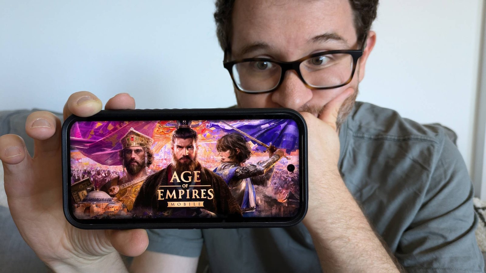
One of the very first games I played on PC was Age of Empires, so the new Age of Empires Mobile game definitely piqued my interest. Sure, it will be a worse and mobil-ier version of the classic series, but it should be good for some nostalgia on the go, right?
Well, after playing for roughly five hours, I’m here to tell you that it’s the most egregious mobile cash-in I’ve ever played.
And look, I always give games a fair chance. I even liked Command and Conquer: Rivals, despite its flaws. But the more I played Age of Empires Mobile, the worse things got.
History smishtory, make them sexy

Nick Fernandez / Android Authority
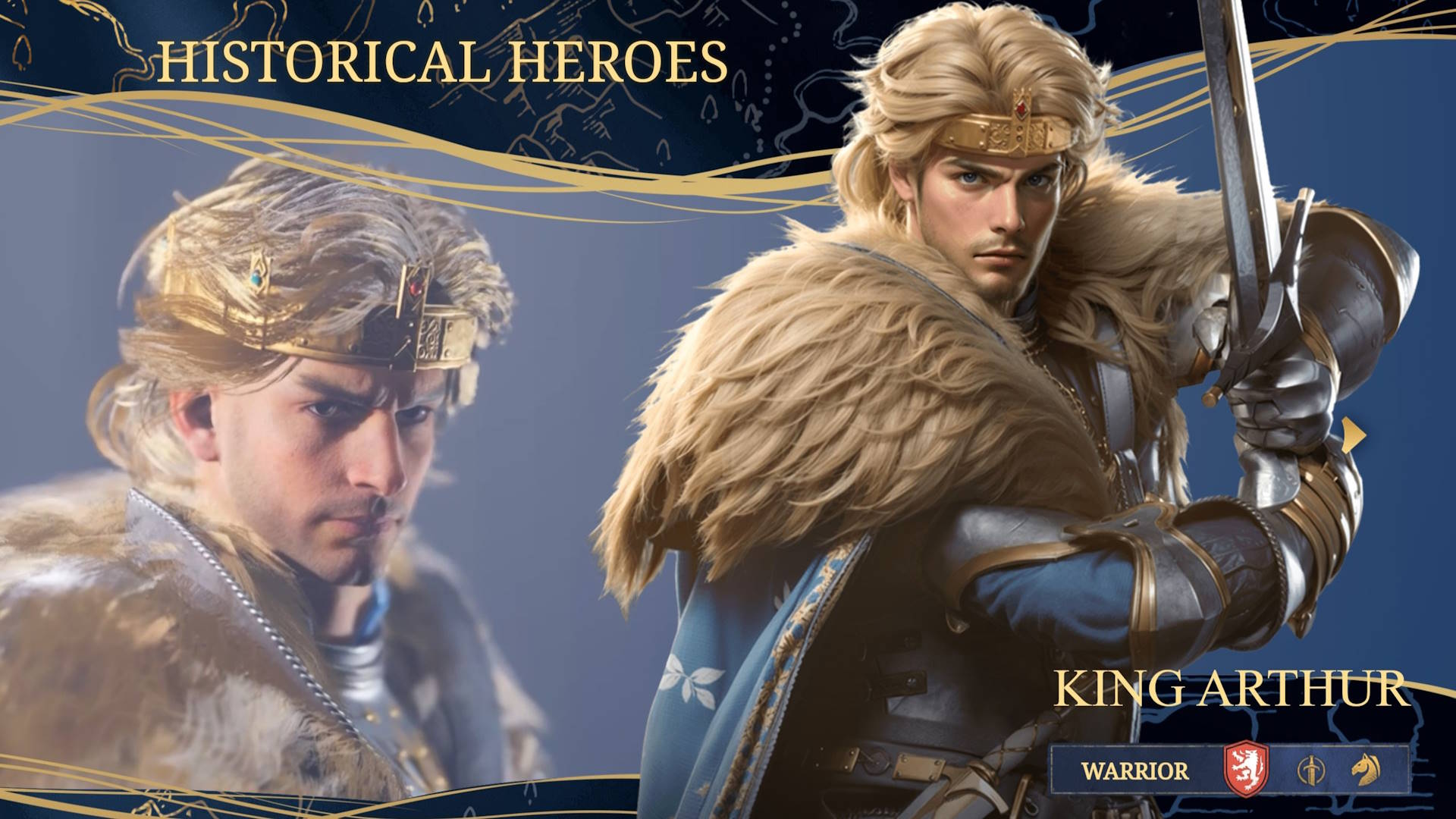
While the game has the same rough aesthetic as Age of Empires, pretty much everything else is thrown out with the bathwater. The setting is made up, historical characters are reduced to gacha tropes (dreamboat King Arthur is my favorite), and the gameplay is a mishmash of every genre except real-time strategy.
So let’s take it from the top. The main protagonist is Josephine, a bland K-Pop wannabee character whose only notable quality is that her father was the emperor. When he’s killed and the capital is sacked, she sets off to find the fabled McGuffin sword and reestablish her empire from a border outpost.
The first few moments of gameplay are the most similar to Age of Empires, although all you need to do is drag an icon on top of some baddies and watch Josephine murder them. However, after that initial sequence, I never saw that style of gameplay again.

Nick Fernandez / Android Authority
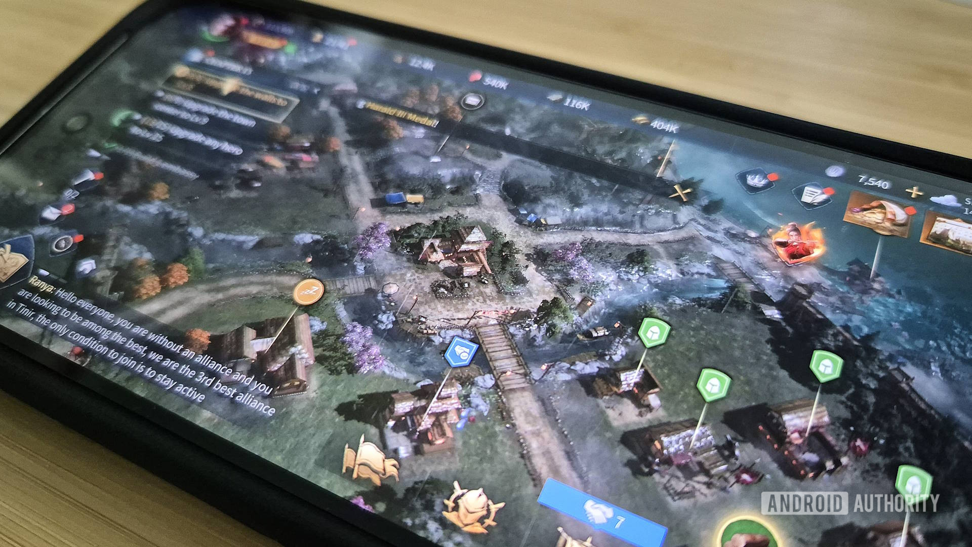
Instead, you’re immediately thrown into a generic city builder, where you assign villagers to camps to collect resources (just like the real game!). I was really struck by how similar it looked to the dodgy city builders from a decade ago, where the main draw was sexy anime artwork. In that regard, the developers have succeeded in making every historical character inexplicably hunky in an AI-generated kind of way, but it just doesn’t quite hit the same.
If you told me this game was from 2014, I would believe you.
After nearly a full day of cursed testing, I was in the Castle Age, which translates to Town Center level 8. Yes, you level up your town center, just like Clash of Clans. There’s also a fishing minigame, because who doesn’t love fishing?
It’s worth mentioning that virtually none of the game mechanics were ever explained. I still don’t know what most of the buttons on the HUD do, and most of my progress was made by tapping on the objectives and following the indications. There are red dot notifications everywhere, and no matter how hard you try they will never go away for long.
Every game except Age of Empires
But things got worse. The next bit of actual gameplay had me sail off to random islands to engage in a ripoff of auto battlers like Auto Chess or Teamfight Tactics. Unlike those games, there are no turns or complexity, so I just watched Joan of Arc wail on Julius Caesar until I won. For the empire!
A little while later, I got access to the world map. That’s where you can see everyone else’s border outpost-turned-empire-aspirant, as well as some random tribes to subjugate for resources. Mostly, though, it’s just huge, empty, and confusing.
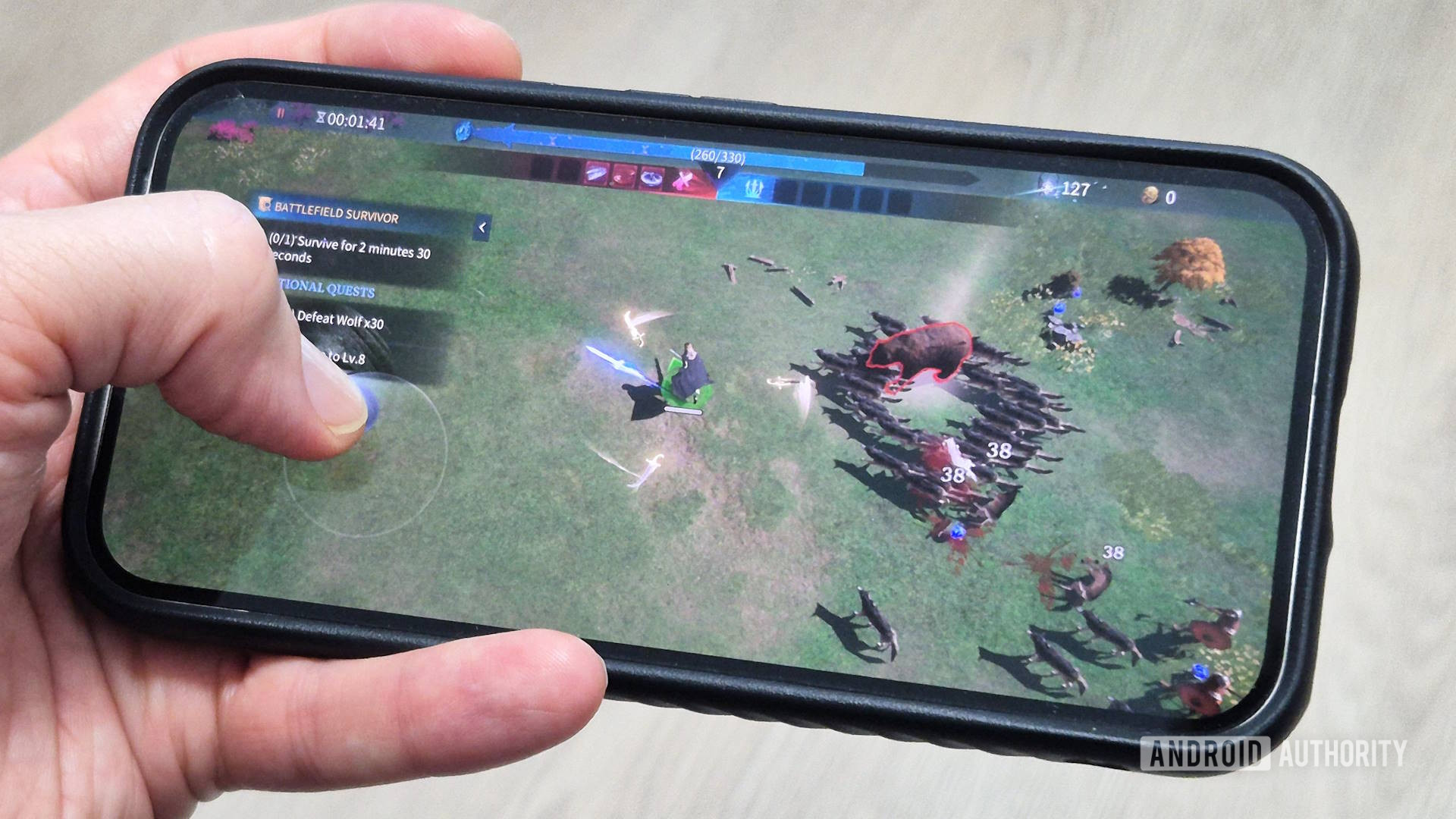
At this point, I was pretty checked out, but stay with me because it gets even worse. After a few hours, I unlocked a new Battlefield Survivor mode. That doesn’t sound very Age of Empires, but I figured it’s better than Auto Chess and wasteland scouting, so I gave it a shot.

Nick Fernandez / Android Authority
Well, it turned out to be a nearly one-to-one copy of Vampire Survivors. Look at the picture above; it’s uncanny. They didn’t even change the color of the experience orbs.
I haven’t even touched on the monetization, which is exceedingly aggressive. There are in-app purchases for more builders, faster build times, gacha pulls, resources, and just about everything else. I also counted a full three separate battle pass mechanics, one of which costs $25.
I have no idea who the target audience is for this game.
I genuinely have no idea who this game was made for. It feels like a budget Chinese developer bundled together a few random off-the-shelf games and slapped the AoE branding on it. The fact that this ever saw a release is a real mystery to me.
What’s even crazier is that there have been decent Age of Empires mobile games in the past. Age of Empires: Castle Siege on Windows Phone was a tower defense game, but at least it tried to do something interesting. The original game even got a full port to the Pocket PC more than two decades ago! What are we doing here, Xbox Game Studios?
Don’t waste your time with this; there are plenty of better games. I’ll be surprised if it’s still around in a year.
Nick Fernandez / Android Authority One of the very first games I played on PC was Age of Empires, so the new Age of Empires Mobile game definitely piqued my interest. Sure, it will be a worse and mobil-ier version of the classic series, but it should be good for some nostalgia on the go,…
Nick Fernandez / Android Authority One of the very first games I played on PC was Age of Empires, so the new Age of Empires Mobile game definitely piqued my interest. Sure, it will be a worse and mobil-ier version of the classic series, but it should be good for some nostalgia on the go,…
