5 months later, I still hate the Pixel’s hidden brightness and shadows sliders
-
by Anoop Singh
- 7

Rita El Khoury / Android Authority
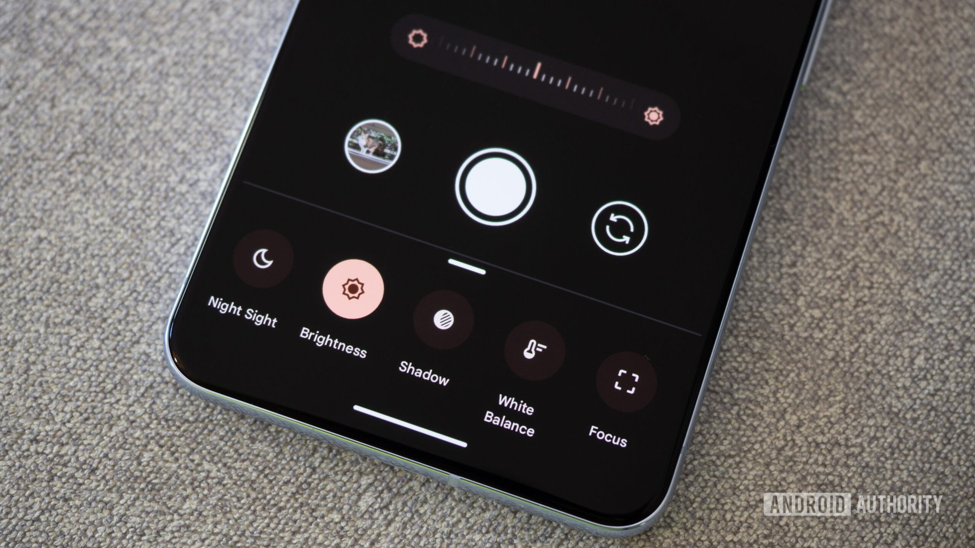
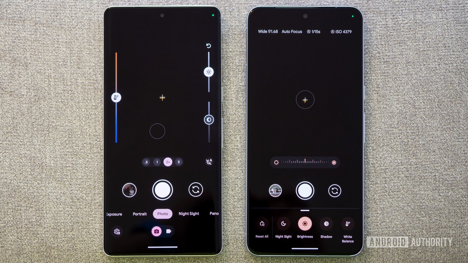
It’s been a little over five months since I first got my hands on the Google Pixel 8 Pro and shot my first photo with it. At the time, I immediately noticed one infuriating change in the Google Camera‘s interface that put the brightness, shadows, and temperature sliders behind the settings/adjustments button instead of keeping them available at all times on the screen.
And, as you can surmise from the title of this article, I still hate that change five months in. I thought I’d get used to it and start tapping the settings button more often, but really, no. That’s not what happened.
Instead, I find myself not using the brightness, shadows, and temperature controls as much as before — probably not even at all, really. A crystal clear case of “out of sight, out of mind.”
Out of sight, out of mind. Instead of opening the options menu more, I don’t use the sliders at all now.
One button, that’s all it took. Hiding these away from view along with the more powerful options of the manual mode menu (shutter speed, focus, ISO) simply ensured that I no longer reach for them because I’m lazy sometimes, and much of my photography is spur-of-the-moment shots, not an elaborate setup. And then, the few times I do make the effort to go into those settings, I still loathe that every slider is separate, so I have to pick one and change it, then pick another and change it.

Rita El Khoury / Android Authority
In contrast, look at the absolute usefulness of those always-there on-screen sliders from the previous Google Camera app version! Slide, slide, slide, capture, that was it. Now, it’s open menu, slide, tap, slide, tap, slide, and finally capture. It’s time-consuming and frustrating.
Personally, I used to use these controls all the time. I’ve easily taken over 10,000 photos with my Pixels over the last couple of years alone and I’d say about 10% of those were shot after a quick manual adjustment. Now, because I don’t use them, my photography has suffered. Yes, the Pixel’s camera is a great foolproof camera in most settings, but sometimes I just need to lighten up those shadows or adjust that color temperature a smidge. Most of my use cases are small edits, but they make all the difference in the final photo.
The Pixel camera is usually foolproof, but sometimes I just need a minor change to get a perfect photo. The sliders allowed that.
I still find myself wincing a few times when I snap a pic and thinking, “Damn, this photo needs a minor edit, so I either have to delete it and retake it again with the proper setting or make sure I edit this one later.” Neither is a fast option.
Oh, what I’d give for a setting that enables those sliders again for those users, like me, who reached for them all the time and liked having them there, always accessible.
Rita El Khoury / Android Authority It’s been a little over five months since I first got my hands on the Google Pixel 8 Pro and shot my first photo with it. At the time, I immediately noticed one infuriating change in the Google Camera‘s interface that put the brightness, shadows, and temperature sliders behind…
Rita El Khoury / Android Authority It’s been a little over five months since I first got my hands on the Google Pixel 8 Pro and shot my first photo with it. At the time, I immediately noticed one infuriating change in the Google Camera‘s interface that put the brightness, shadows, and temperature sliders behind…
